7 QC TOOLS
Hello friends,
Today, we are going to understand about 7QC tools which is used for problem solving.
In today's time, due to the increasing competition in every field of business, the attention to quality is clearly visible. 90 percent of problem solving in industries is resolved from 7 basic problem solving tools and it is also known as 7 QC tools. 7 QC tools or problem solving tools are the quantitative tools which are used to solve the problem at any work related place. Without help of 7 quality control tools, Quality Circle project can't be completed.
There are 7 basic problem solving tools are as below:-
- Check sheet
- Histogram
- Scatter diagram
- Pareto diagram
- Cause and effect diagram
- Graph & Control chart
- Flow chart
1. Check sheet:-
It is a format used to collect data in real time at the location where the data is generated.
Check sheet plays an important role in 7 Quality Control Tools. It provides backup to other tools working in problem-solving.
Purpose :
- Check sheet is a very important tool for collecting and organizing measured or counted data.
- Collected data can be used as input data / backup for other quality control tools.
Benefits:-
- Data collection is making in systematic and organized in right way.
- To finding put the main source of problem.
2. Histogram :-
Histogram is a frequency distribution in the form of a graphical representation that shows the frequency distribution in order to organize the maximum number of data values taken.
Histogram is very important tool and used for understand the distribution of collected data. After that, it is easy to take further action. Its shape is similar to a bar chart but in fact it is different from a bar chart.
Difference between histogram and bar chart:-
There are two main difference between histogram and bar chart:-- There are no gaps between the bars in a histogram.
- The area of each bar is proportional to the frequency that it represents, hence total area is proportional to total frequency.
When to use Histogram:-
- To make the distribution of the collected data easily and quickly accessible to others.
- When we study on numerical data.
- To understand the shape of distribution, especially when determining whether the output data of process is distributed approximately normally.
- To seeing the distribution variation between two time periods, or when a process change has occurred from one time to another.
- To determining whether the outputs of two or more processes are different.
- To analysing whether a process can meet the customer's requirements.
- To study or analysing what the output from a supplier's process look like.
3. Pareto diagram :-
Pareto diagram is a prioritisation tool which helps to prioritise after analysing the problem. Vilfredo Pareto was the father of this tool, so Pareto diagram is named after his name. It works on principle of the "80-20" rule.
"80-20" rule means that 20% of the people control 80% of the wealth. Likewise, in the manufacturing sector, 20% of the product line may be generate 80% of the problem or waste or from 20% of the customers, we get 80% of complaints and so on.
When to use Pareto :-
- Prioritising problem
- Analysing symptoms
- Proving effectiveness of remedy
4. Scatter diagram :-
To identify the correlation between two variables.
It shows the graphical representation of relationship.
5. Cause and effect diagram :-
It is also known as Ishikawa diagram.
Fishbone diagram is a tool to identify potential cause, root cause to identified after validation.
Purpose :-
Graphical representation of potential causes of a problem.
Benefits :-
- It helps to identify the potential cause.
- It heps to Establish the brainstorming relationship.
- It helps to understand the causing factor of the problem.
6. Flow chart :-
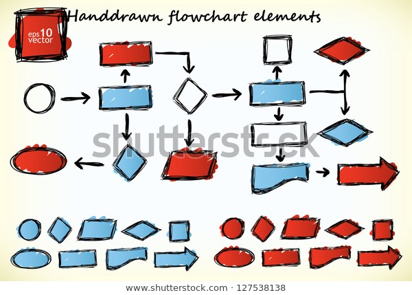
Visual illustration of the sequence of operations required to complete a task.
यह हमे किसी process के sequence को समझने मे help करता हैं। यह एक schematic drawing होती है जिसमे हम Process को step by step समझते कि process हमारा कैसे Flow करेगा।
Benefits :-
- यह हमे process improvement की opportunity को identify करने में मदद करता है।
- Process को समझने मे help करता है और अगर process मे कोई non value added activity है तो हम उसको भी identify करके improve कर सकते हैं।
7. Control chart :-
A control chart is a line graph used to display variation on time order interval.
(Control chart एक line graph होता है जिसका Use हम एक interval of time मे process के variation को देखने मे करते हैं।)
A centre line and control limits are placed on graph to help analyzing the pattern of data.
Purpose :-
- Control chart indicates whether a process is in control or not.
- It ensures product quality level
- To identify the dynamic or special causes of variation in a repeating process
Thank you.
Some of related question that help to improve your basic knowledge.
Some of related question that help to improve your basic knowledge.


No comments:
Post a Comment